Thursday 9 December 2010

HOW DID YOU USE MEDIA TECHNOLOGIES IN THE CONSTRUCTION AND RESEARCH, PLANNING AND EVALUATION STAGES?


Planning and Research Stage
In the planning/research stage we used many technologies. These were mainly internet based because we had to look at existing music videos to analyse and get ideas for our product. During our research phase we used youtube quite a lot. You tube is one of the best websites allowing you to access millions of free videos. This allowed us to find any video that we wanted to analyse with ease. We also used google a lot to find images and information. We used google because as a search engine it has the most accurate results to get the information that you wanted, because we wanted to film on a beach we had to look up the tide times and the sunset times which took no time at all thanks to google. These would be fairly standard uses when researching anything because they are so good. They really helped us in finding the indie videos we wanted to analyse. As a free source it is brilliant to use.


Also in the planning stage we used myspace.com as a way of communicating with our band. Myspace is a social network where people or groups can display videos and chat. Myspace was brilliant as we were able to find out what the band were like listen to their music and speak to them to see it they wanted to have a music video. When we got our band and were more familiar with them we then communicated over the lead singers facebook page. Facebook is another social network site that does similar things to myspace. Using facebook we were able to arrange filming dates and consult the band about different aspects of the video.

We also used blogger in the research and planning stage to write down and view all of our work so far. As we used blogger last year we were very familiar with it. Setting it up was very easy and posting is as simple as can be. The good thing about using it is that because everything is stored online you can go back and edit/change it or add more whenever you want, this makes it so easy to do a little bit at a  time.     


Construction Stage
We used more technologies in the the construction phase than we did any other. As well as using all the previous websites during the construction stage we also used Cameras, tripods and many other things. We used 3 mini-DV cameras when we went on both of our filming days. Taking 3 was good because we were able to get all the angles we needed in a quicker time. Having three cameras was essential due to the battery life of the cameras. On both of our filming days we had one camera that ran out of battery. On the upside the footage we managed to get was a good quality. The quality of the footage is some part was due to the tripods used. Using the tripods allowed us to keep our footage still and because of the extendable and retractrable legs we were able to get our footage at different levels. The only bad points about the tripods were that the cameras didn't always screw on  properly so they could be quite loose. This meant we had to keep the tripods really still on location to get the best quality footage.

We bought our own taped to use in the cameras. These tapes had well enough space on them to do what we needed. The tapes weren't a problem as long as the cameras worked. 

When on location we used a camera and our iphones to take pictures to use for our CD sleeves and posters. Strangely the iphone pictures looked a better quality than the actual cameras so we used them instead.


We used imovie, to put all of our footage together to create our finished music video. Imovie is a small editing software that allows you to create small films and videos. It is a really good software doing what we needed to do. It was really easy to edit all the clips to the exact time scale we needed as it lets you work down to 0.01 seconds. Imovie would struggle to something on a large scale as it isn't a professional editing software.
Evaluation Stage
Through our evaluation stage we used the internet mainly. We used youtube again to upload our finished music video and to upload our band interview. This allowed us to put it on blogger to be able to evaluate it. Blogger was the main use in the evaluation stage as we used this to do every evaluative thing we have done. On our audience research we used Microsoft Excel to create our graphs.

WHAT HAVE YOU LEARNED FROM YOUR AUDIENCE FEEDBACK?

Audience feedback is very important. The audience feedback allows you to see what people like and dislike about your product. This then lets you edit it so you get a good overall video that everybody likes. As well as this audience feedback gives an unbiased opinion of the video which will in turn find the mistakes that somebody making the video miss or subconsciously choose not to spot. As much as the audience feedback can be disheartening it will improve your product in the long run. It is important to ask members from your own target audience because it is important that you get the correct representations across to your main audience. After this has been achieved it is also good to ask people outside of your target audience to see what reception you get. If you ignore your audience feedback you risk your audience not liking your final product and it will end up being a flop. We had 3 stages of audience feedback. The first stage was research, the second stage was during our editing and the last stage was after we had finished our editing.

First Stage (Research)
We asked 3 groups of people in our first questionnaire. This questionnaire was designed to find out what sort of genre people like and what they liked to see in music videos. This questionnaire was a good start to establishing what we were going to do for our music video. This helped us plan our products to get what people expected on their. This stage also helped to define our target audience and work out who we would be marketing to.

Second Stage (Half Edit)
We asked 8 people to look at our video after we had edited half of it. We had edited all of our narrative scenes into the correct places and timing. This questionnaire helped us to find out what bits people did and did not like. By asking this half way through we were able to look at the results and try to fix some of the things that we could maybe do better, or change them completely.  In this questionnaire we found out that most people didn't understand our postmodernism element. We decided to leave it in because we felt that it was a good shot that showed of some good editing and a few people were understanding it.

Third Stage (Full Edit)
We asked 7 people to look at our video and ancillary texts after we had finished them all. We asked it then because we wanted an overall opinion of the finished products. This also left us a little bit of time to change things if we needed to. This questionnaire gave us better results as we had good ratings and more people understanding our postmodern elements than not. The last stage of the audience research was the most important because if people didn't like it the entire product wouldn't be listened to or viewed which would be a disaster.

HOW EFFECTIVE IS THE COMBINATION OF YOUR MAIN PRODUCT AND ACNCILLARY TEXTS?

The element that links all of our products together is the underlying beach element across the products. I believe that our products are cohesive, the colours matched well and the all the visuals work well together. You would know that our products were part of a set and that was what we were aiming for. This is important from a marketing view in creating an image of the band that needs to be the same on all fronts. This is important because you want to create an image that is recognized when you look at just one of the products. This will help to sell the product as well because being able to recognize the band from one of the products will reinforce your opinion when you see  a different product.


This CD sleeve is the Kooks 'Inside In Inside Out'

This CD sleeve is a dark grey which mirrors the colours in their music video. This gives their products cohesion and has developed into a main point recognised in their band and the indie genre. We have tried to do this with ours so that they look like each other in colour and by genre.

Opposite to this CD cover we have the narrative on the CD cover. This is because our narrative is the main thing to watch in the music video. It also makes for more interesting pictures. We decided to make this our main cohesive element across the texts because it is the most easily recognisable.

What we tried to do worked as both the colours and the visuals worked well.

WHAT WAY DOES YOUR MEDIA PRODUCT USE, DEVELOP OR CHALLENGE FORMS OF CONVENTIONS OF REAL LIFE MEDIA PRODUCTS?

Our media product uses the typical forms of conventions of real life media products of it's genre. We have looked at other videos and tried to stick to the typical conventions rather than trying to challenge the typical conventions. We thought that this would be easier to get across in a music video and would make our genre clearer.
Our performance sections use typical conventions of our genre as they are performing in a practise room as if they are rehearsing. This makes the band look relaxed and like they are having fun which is a typical convention of the indie genre. We have also matched the audio and the lyrics to the visuals while thinking about the mood of the song. As well as this we have used videos such as 'Henrietta' by The Fratellis as the typical colour of the indie genre. The dull grey colour and many browns are used in a lot of indie music videos. We have used this colouring in our music video.


We have included a narrative/performance concept to our video which is very similar to the majority of indie videos. This is because the indie genre isn't about the performance as much as much as it is the individuals
and their representations in the genre on screen. A lot of indie band s are represented as relaxed and easy going in their videos. We believe we have managed to do this in the performance section of the video. We have also tried to mirror the indie genre in the clothing of the actor. it is important that you get the right clothing in the genre or you will be sending out a completely different message to what you should be representing.

We have stuck to the typical conventions of music videos in general as well as the indie genre by keeping the pace of the music, in a similar time to the visuals. We have done this while trying to match the lyrics to the visuals as well. Examples of this are when the lyrics say 'falling down' and 'Slipping through my hands' we have quite literal shots of things falling down and slipping through hands.

Sunday 5 December 2010

The Final Products

Music Video
I am really pleased with our final video. I think that with a non existent budget we have managed to create a professional video that looks good. I believe that we have challenged the conventions of the genre and believe we have represented them well. I believe that we have edited to the best of our ability and that we have made a good music video that the band and the examiners will both enjoy.

Poster
I think that the poster that we have created looks professional and matches the genre well. When creating it I thought that we would put special effects on if the picture needed it, however we wouldn't put any on if we could once we made it look professional. I believe the simplistic nature of the picture works well without any effects, I also believe that if it was on a wall amongst any other posters it wouldn't look out of place.


CD Sleeve
Our CD sleeves and inserts only focus the narrative part of the video as we thought that would be the most interesting thing to look at. As well as trying to make it look good so that it makes good marks I also believe that it is good to look at and will make people want to buy the album.


Cohesion
Because we made our video first and had some amazing pictures we decided to base all our other products around the narrative we filmed. This has allowed us to start off with a cohesive element. That was the biggest challenge. Being able to construct the products together in one day allowed us to keep our cohesion to a high standard. We didn't just have similar pictures to create the cohesion, each picture had the same backdrop and after we constructed it all we made sure all had the same style writing 'Rage Italic' for the bands logo and 'Rockwell' for the other writing. Also all the writing was in the same colour. This allowed all our products to look similar and be cohesive. If you showed people our music video and gave them a line up of posters and CD sleeves I believe most people would recognise that ours are linked. This is good because that is exactly what we strived for. We know this from the positive feedback we have been getting about the cohesion.

Monday 29 November 2010

Finished Music Video


  This is our finished music video. The version that has been sent off to the Examiners.

Friday 26 November 2010

Photoshop Editing, CD Cover and Poster

To create our CD covers and poster we took pics on location. Because we filmed on two different locations we decided to take the pics from our beach location. We took our pictures on an iphone camera and a normal camera but the iphone pictures were much clearer and sharper. We took several photos from many different angles so we wouldn't be short. We had a rough idea before we went which enabled us to start photoshopping almost as soon as we got there. In our video we have a shot where the water washes some writing away. We wanted our text to be similar and almost be the text that the band is represented by. This was implemented across both the poster and the CD cover to add a cohesive element. The text we used was Rage Italic. All the text we wrote was in white to create cohesion. The pictures below are the originals the finished covers will be in a Final Product Post later.    
Poster
To create the poster we took a photo that we thought was the best photo for the poster. It included our actor in the centre of the photo right at the bottom. As the actor was small in the photo it allowed us to put the writing in the sky above. We wrote the name of the band in rage Italic and wrote the rest of the information on the poster in Rockwell as the release date and other information was not to be written in the bands text. The only other text we used was to right the comment from our record label to make it stand out. We chose white text as it was the text that looked quite clearly the best in the places we wanted it. On the poster the text is central to match the actor at the bottom. Our poster is the same colour it was originally however we did change the brightness to see if we could change the glare of the sun. We included the bands myspace address at the bottom right which is the only text that isn't central. We decided to have this not central because it would have been over our main image which we did not want.

Poster

CD Sleeve's
We decided to split our group to do the CD sleeves. I did the back cover and the inserts while Azza did the front cover and James focused on the poster. We changed the front and back cover pictures that we had taken to black and white. This looked good but didn't work with our white text and the difference in the two pictures colour was quite big. This meant that again we removed the special effects and let the simplicity and elegance of the pictures come through. The inserts were much easier than I thought. On photoshop we had template sizes that were to the size of a cd cover. We had several brilliant pictures that we knew we wanted to use, because the pictures were so good we didn't have to do many special effects. The old phrase less is more. One of our inserts is a two page spread of the location where we filmed it looks brilliant however there were only a few birds on the picture and they were all right up the top and almost out of the shot. I thought it would be good to add an extra bird in a bit further down. To do this I used photoshops Magnetic Lasso tool this allows you to outline a particular part of the image. I drew it around one of the birds from a different picture and copied it over. The bird in the two page spread that is photoshopped is the far left one. The other CD inserts were all relatively easy because we did a similar thing in playing around with the colours and adding a bit of text to them.

Front Cover
Back Cover


Although we did these separately we were all around one table and were constantly helping each other out and suggesting different things. As we were so close to each other we were able to see all our products and were able to make them as cohesive as possible. We believe we have done that and have received positive feedback on the cohesion of them.

Thursday 25 November 2010

Editing Overall

Overall I think the editing went well after uploading our footage we knew our clips were good and that they could work, the pacing of our editing looks good and the timing of the editing is good. As well as this the few special effects we used worked really well. Unfortunately there are some sections where the singing is out of pace with the song because the singer sings at a different pace to the song. The editing was good because you are able to see it come together and you get to make the cuts and when you are finished you can look at it and know exactly how you made it.

Wednesday 24 November 2010

Filming Overall

Overall I think that the filming went really well. We managed to get our outside filming done in one day, so we didn't have a problem with different lighting. The inside filming went well because we managed to get all the shots we needed with ease because of the great location. One thing that could have gone better was that the we accidentally left the night shot on one of the cameras for one or two of the shots. This isn't a big thing in terms of the final product but it is annoying because we know it is there.

Tuesday 23 November 2010

Post Modernism Second Part


 Our second post modern element is at 2:14 in the video. It comes from the film "Les quatre cents coupe" or "The 400 Blows" (1959 French Film). We used this as a post modern element as this is a very famous and very ominous ending to a film. This clip is about a boy who is running away and runs for as long as he can until he reaches the sea. At this point the boy turns around and looks directly at the screen to show that now he has ran away he doesn't know what to do. We included this because it is very famous but also because there are similarities in the location as both videos are on a beach and the characters are in a similar position.

Post Modernism First Part

Our first post modernism element occurs at 1:20. It isn't a reference to another video source but is a play with the timing of a piece of footage. In this clip the actor throws a rock into the sea, half way through the arc of the throw the rock then comes back to the actors hand and then she throws it again. As if she is throwing it twice. This represents not having second chances in life as is represented in the lyrics as the girl is singing about a boy leaving her. We included it as we knew it would be a post modern element but also it raises questions.


We have received a lot of feedback both positive and negative about this clip but we have decided to include it in the final version of the video as we believed that there was enough reason for us to do so. The negative feedback we received was that it wasn't understood in the context of the song. The positive feedback we received was of people understanding it and it worked with the pacing of the song and as a clear post modern element.

Monday 22 November 2010

Editing - Finished Edit

After we had all of our footage edited and everything in place we played the video back several times while all three of us watched it carefully to see if there was anything that we could see that really didn't fit.

We did pick up some really simple errors where we hadn't actually muted the clips and you could hear the sound change. This happened a bit because we had so many clips that were milliseconds in length that we were bound to miss a few. We sorted all that out and then we decided to to include our extra footage of the band walking down the steps. Similar to our very first clip it was a bit slow so we decided to speed it up. It worked really well with the timing and looked good but the sound in the back ground was all sped up and didn't sound right at all. Even when we reverted the clip back to the original you could hear other music in the background as we were at a recording studio. We decided to use the clip sped up but muted. Again it looked brilliant but sounded really odd as there was no sound. It was a real head scratcher, we looked to import footstep sound but couldn't get it to work well. In the end we decided not to use the clip at all. This was really annoying as we wanted it to work

Sunday 21 November 2010

Audience Feedback - Last Stage (Finished)

These are the questions we asked our audience after we had finished all of our editing.

1. What is your overall opinion on the finished product?
- Well constructed.
- Nothing Special
- Quite Good
- Relaxed and Calm
- Good
- I think it is good
- It's alright

2. Is there anything that you did not like?
- The birds
- The rock throwing
- The way one of the band members dances
- Singer not blonde
- The stone part
- Black and white clips
- Old fashioned feeling

3. Is it clearly showing a narrative/ performance concept?
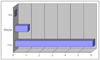
          Yes - 6       Maybe - 1      No - 0


4. What do you think of the effects we have used?
- Few and far between but fit in well.
- Perfect Use
- Slow motion worked well
- Appropriate not over used
- Good loved the ending
- There ok
- It's alright

5. Did you like the fact that we did not use many effects?
             Yes - 6         No - 1


6. Do the Poster and CD sleeve look cohesive to the Finished Music Video?
        Yes - 5         Maybe - 1       No - 1


7. What is your opinion of our chosen band?
- Ok
- They seem alright
- Really liked them.
- Seem nice enough
- They are quite scruffy
- They are good
- I don't like their music

8. Would you be interested in the album after you watched the Music Video?
- No I don't like the song
- No
- I'd have to listen to their other songs first
- If the melodies were similar perhaps yes
- Probably because I love indie.
- Maybe a free download.
- No it's not what I normally listen to.

9. How would you rate the finished product out of 5?(circle answer)

BAD
- 0
- 1
- 2
- 3------ 3 people
- 4------ 3 people
- 5------ 1 person
- GOOD


10. What Genre would you think this music video relates to?
            Indie - 6          R&B - 1


11. Does the tempo of the music fit in with the imagery?
             Yes - 6      Maybe - 1      No - 0


12. Can you spot out our Post Modern element?
              None - 2
              One   - 5
              Both  - 0


13. Do you like the design and the layout of our finished poster and CD sleeve?
                  Yes - 5               No - 1

Saturday 20 November 2010

Editing - Full Edit (All Footage)

After filming our final footage of the performance part of the video, we had to edit everything into the correct sequence. We had to make sure the timing and clips were right and then it would be finished.

DAY 5
On the first day of our full editing we decide to do the first sequence of our music video. We knew we had 14 seconds of intro music until all the guitars started. The plan was to get them to walk onto their instruments while their music was playing and then when all the guitars kicked in they started playing as well. We neievley only took one shot of this so it was only at speed, and it didn't fit. So we decided to speed the footage up to the right time frame so that it fit. Ironically the sped up footage worked really well, better than the original.

DAY 6
The next day we did the main bulk of the editing getting all the clips we knew we wanted in the right positions. For example the main chorus with the loud singing we wanted a shot of the lead singer, and we wanted a shot of the drums and guitar where they were best suited. We managed to edit over half the song all into the right timing as well. This was the most difficult part as we had several clips that were from different angles and lasted the entire song. When we then cut these clips we had to find the right start point cut it than find the right end point and cut it. Once we then put it in we had to make sure that the lips were in sync and the guitar strums and drum beats were in time. This was really difficult as in a short period of time a lot happened in the footage. If the clip was then wrong in timing once we cut it we then had to find the original clips and cut clips of around 0.01-2 seconds to get to the right timing. We couldn't delete any of these clips in case we needed them later so we had hundreds of 0.01 size clips everywhere. This made it really difficult and we still couldn't get the timing exactly correct as it would have taken a really long time as it was near impossible maybe it was impossible. What didn't help was that we had a recording of the song and were placing the clips muted over the music and the timing of the singing was different (all be it milliseconds). However this meant that the singer could start singing in time and be out of time by the end of the line which is impossible to change.

DAY 7
On this day we edited the last of the footage into place. One specific part we wanted to get right was on shot of the guitars. The song played one guitar and then a second kicked in with a different tune over the top. We changed the sound levels when the second guitar started to raise the sound and emphasise the fact that there was another guitar. We wanted this bit to be perfect as we had emphasised it. We had to make sure that we had the right guitar over the right section and had to make sure every strum was in time which I have previously stated was really difficult.

Saturday 13 November 2010

Filming Location

After thinking about the places we could film in we finally chose our two filming locations. The outside location wasn't too difficult to choose but the inside location took some thinking.

Outside Location
We knew we wanted to do a Narrative and a Performance Video, this meant having a sort of story to tell. We did some work trying to match visuals with lyrics and we decided that with the lyrics we could film on a beach. This would give a nice setting and potentially some really nice shots. Although it doesn't sound glamorous we chose Weston beach as our location. It doesn't sound like it would be a good filming location but we managed to find a place that was quite quiet to film and it did look really nice.


Inside Location
We were really struggling with an inside location, we needed it to match the indie genre and be quite relaxed but we also needed it to be big enough to film in and be capable of getting the shots we needed. While looking around to find the right place we were struggling as we could not stroll up to a house and ask to see the inside. We didn't think we would be able to film what we had in our storyboard and would have to change our ideas and maybe even make it all narrative. We were running out of time to get the filming done and was starting panic, then we spoke to the band. They suggested we film where they practise on the weekend. The Colston Hall Practise Rooms. This was perfect as it fitted with the genre and was just right for what we needed.

Friday 12 November 2010

Filming - Part Two

We couldn't wait to do our second part of the filming because we had edited all our previous footage and were waiting for a day that the band were all free. We knew once this filming was done all we had to do was edit it all into the correct place and make sure it was all right. We knew the angles we wanted to film before we went because of the storyboards. This allowed us to go and get all the footage that we needed so that we had enough and it didn't look as though we were putting in angles for angles sake. We took three cameras setting them up and letting the band play an entire song, then we would switch the cameras around and let them play the full song again. We did this about five times, this then gave us about fifteen angles which we could include anywhere we wanted over the entire film. Doing this also covered our backs if any angles didn't work at all, which they didn't as they didn't comply with the 180 degree rule and other reasons. The filming went really well as we only had an hour in the recording room. I thought that because the song was roughly 3 minutes long we would only need half of the time. However with having to set up all the angles and refer to the storyboard quite often we were struggling for time but we managed to get all the footage we needed and a bit extra. Our video starts with the band walking onto their instruments and getting ready to play. We filmed a little extra on top of that which was them walking downs some steps and into the room as we had a bit of time before we went into the recording room. We thought this would be a good intro so that the music doesn't start at the same time as the footage.

Wednesday 10 November 2010

Filming Schedule 2

Our second filming schedule was easier because we didn't have nature to contend with this time. We decided to take the same amount of cameras and two tripods. This was crucial for this filming as we needed the shots to be completely steady throughout the whole song. We didn't have to worry about clothing this time as we were filming the band in their clothes. Our main problem was being able to film all the shots in the one hour we had to do so. With everything we needed written down and a storyboard to hand that wasn't a problem.

Tuesday 9 November 2010

Audience Research - Second Stage (Half Edited)

These are the questions we asked to the people half way through our editing process.
We got 8 people to watch our video and comment on what they thought so far.


1. Do you like the music video so far?
        Yes - 8      No - 0


2. What genre would you relate this music video to?
         Indie - 7     R&B - 1


3. What is your best part so far?
        - The Ending           
        - The Birds
        - The Bit with the rock
        - The bands name appearing in the water
        - The sea washing over writing       
        - The beach bit

        - The end scene
        - The birds flying


4. What would you change so far?
        - More colour
        - Maybe another character
        - Less Black and White
        - The start
        - The stone throwing
        - Rock throwing
        - More Birds
        - Not much


5. What do you think of the timing of our editing so far?

6. Do you think the narrative goes well with the chosen song and chosen genre?
             Yes - 6       No - 1     Maybe - 1

7. What do you think of our post-modern element?
     - It is good
     - Don't quite understand it
     - Not sure
     - Didn't see it
     - It was alright
     - Didn't Understand
     - Cute
     - Really good but didn't know the other one.


8. Do you think that our special effects fit in with the song's pace and the type of song?
           Yes - 5          Maybe - 2          No - 1

9. What is your representation of the band from the video so far?
      - Good
      - Indie
      - loved them
      - they are alright
      - Very indie
      - They sound cool
      - Peaceful
      - Not bad

10. Are we as a group conveying the typical representation of the Indie genre with the performance section so far?
       Yes - 5        Maybe - 3        No - 0

11. From watching some of our music Video, what would you expect to see on the CD Sleeve?
       Narrative - 5             Performance (The Band) - 3


12. So far what would you rate our unfinished music video out of 5?


BAD
- 0
- 1
- 2
- 3 ------ 5 People
- 4 ------ 2 People
- 5 ------ 1 Person
- GOOD (Circle one)


Monday 8 November 2010

Editing - Rough Edit (First Footage)

DAY 1: To begin our editing we first uploaded all of our footage onto the macs. We had to separate the footage from one giant to clip into the clips we filmed. This gave us a good opportunity to watch all the footage and see what clips worked and what didn't on screen. We were happy with the amount of footage we filmed that was really good and worked well. We had to accept that some of our footage was not usable due to the camera shaking and different lighting problems.

DAY 2: Day 2 was where we began to put all the clips together in a rough edit. As we didn't do all the filming on the same day we were only able to do a rough edit as all the clips would be moved again and some wouldn't fit. Referring to our storyboard made it easier as we knew where we wanted the clips we filmed to fit in with the lyrics. The difficulty came when we had shots that we filmed on the spur of the moment as we thought they would work.

DAY 3: By day 3 we had a lot of our footage into a rough position and new how much more we needed in terms of time to make sure we had enough footage for the whole song when we filmed the rest. We also started to perfect the editing on the shots we knew were going to be in the final film.

DAY 4: On day 4 we finished all of our rough editing of our first footage. We also muted all the sounds of our clips so that you could only hear the song. We managed to edit our ending by reversing the clip and slowing it down slightly to give the right effect. The shot of the writing appearing in the sand ends when the music ends. We then added another clip after the music finished of the girl walking off the beach, on this clip we kept the sound of the beach on it and made a sound bridge adjusting the levels so that the change in sound wasn't able clear so that it fitted well.

Saturday 9 October 2010

Filming - Part One

We had to complete our filming on two separate days as we we had to film the band and our scenario shots. We decided to film our scenario shots first. We had our storyboard and had an idea where we wanted to film. We decided to film on Weston beach at sunset. we chose a day according to the weather forecast as you won't get much of a sunset with the clouds out. However the forecast wasn't 100% reliable and it didn't look promising. We knew what time sunset was where it set and what time the tides were in we just needed the weather to work in our favour. We were in luck a gap in the clouds for around an hour exactly when we needed it. We managed to find a good space where we could capture everything we wanted.
 We only had a short time to film in so we got there a few hours early and practiced our shots so we knew how to do them. We had to do all the shots that day because we needed them all to have the same light. It would be near impossible to get the same light and sunset and everything else on another day. We took three cameras and one tripod so we all had a camera to use and could all do the filming. As we only had one tripod we had to improvise and rest the cameras on other things to keep them steady. Some of our footage was a bit shaky and we might not be able to use it in the final product.


We had one shot we could film before the sunset. This shot was the one we most looked forward to as it was a good idea. We wanted to write the name of the band in the sand and have the tide take it all away as it came in. We then hope to reverse the clip and hopefully it will look like the tide comes in and then back out and the writing will appear on the floor. 

While we were filming we managed to take a few nice stills as well that can be used in either our poster or our CD sleeve.

Wednesday 6 October 2010

Filming Schedule

We had to prepare before we went filming to make sure we had everything we needed. We worked out we would take 3 cameras and hopefully 2 tripods because we didn't have many. Unfortunately we only had one so we would have to improvise in keeping the other two cameras steady. We also had to work out what props we needed and what clothing we needed the actor to wear. This was important because we needed to portray the indie genre accurately. During this we also checked the tide times for the beach and the sunset times. This was good to do because it made us think of what we needed to look out for so that we were prepared and could get all the filming in one day.

Tuesday 5 October 2010

Location Thoughts

We are thinking about the locations to film the inside shots for our video. We don't know many places we could use but we are hoping to find something that looks like a basement and hopefully has some stairs for them to walk down. We have two possible locations of one of the band members basements or one of our mates garage. Unfortunately none of these locations are the best for what we want but we will have to make it work.
The outside location is a lot easier seeing as we want to film on a beach we are only half an hour away from Weston, we have decide to go to Weston beach.

Monday 4 October 2010

Storyboard


This is my storyboard. We will use our storyboards for all our filming and hopefully it will make our lives easier. Unfortunately I wasn't able to scan it in so I had to upload picture versions.

Sunday 3 October 2010

Audience Questionnaire - First Stage (Research)

Our audience questionnaire was completed on Microsoft Powerpoint and was a visual presentation with 3 Videos as well as a questionnaire. The questions are listed below. We recorded the results of the questionnaire and will post that as well as the answers in text.

The three videos we showed were The Kooks - "She moves in her own Way" - Indie
                                                     Slip knot - "Me inside" - Metal
                                                     TI - "I am Back"  


- R&B
Out of the people we asked we are writing down the three best questionnaires that we thought were good.
- Each new line like this represents a new person.

1) What music Genre do you listen to?
- Rock, Metal and Punk
- R&B
- Rock and Metal
2) Why do you like that genre?
- The emotion conveyed in the music.
- Generally think their good and enjoy them, I also like to dance to the music.
- It's real music and it uses skill opposed to other genres.
3) Do you watch many music videos?
- Yes I watch a lot.
- Only the videos in the genre I like.
- Yes but only in the genres previously stated.

4) What aspect of music videos do you like?
- The narrative and some bits of performance.
- The portrayal of the song and the scenery.
- Funny and weird stuff.

Videos shown at this point.

5) What type of genre would you relate to these videos?
- Indie, Metal, R&B
- Indie, Rock, R&B
- Indie, Metal, R&B

6) What about these videos makes them the genre that they are?
- Indie - Stereotypical dress and low key style.    Metal - Fast editing and less emphasis on the face as to keep focus on the song and not the artist.   R&B - The lighting in the scenes.

- Indie - Their style of clothes and the way they play the guitar.   Metal - Gothic style and music that can blow your ears.    R&B - The lighting and the scenery were typical of R&B videos, it was also kind of Gangster like.

- Indie - The video displayed the typical conventions of the indie genre with their clothes and the style in which the video was filmed and the way they played the instruments.  Metal - I enjoy the metal genre and have to say that the narrative didn't describe the genre that well, however the clothes and style of the characters was accurate.  R&B - Typical conventions of the music genre in the lighting and narrative, almost as if more emphasis is put in the video than the song.

7) Does indie music interest you? If so why?
- It's not bad but I would rather listen to something else.
- I only like the songs from particular indie bands.
- It doesn't interest me in the slightest.

8) Do you pay that much attention to the artwork on a CD sleeve?
- Yes I always look at the Sleeve.
- Yes if the front interests me than i will look at the back to see which songs are on the CD. If I don't like the CD sleeve of my favourite artist I will download the tracks I like instead.
- Yes I am wearing a T-shirt with an album cover on it now. I would still buy the album if the artwork on the sleeve wasn't good.

9) What would you expect to see on an indie genre CD sleeve?
- I would expect to see something within the narrative on the CD sleeve.
- The typical indie styles and clothes.
- Character looking relaxed and the sun shining.

Saturday 2 October 2010

Audience

Our audience determined by the band was 14 - 20. We have to make sure that our video will fit the target audience in the visuals while making sure that they fit with the song as well. This is important because we want the video to be a real representation of the bands music.

The Birds and The Magicians - Interview


When we chose our band we decided to conduct an interview to see what there representations of the band were. This would then allow us to get there connotations in and the connotations of the genre. We did this because as well as getting a good grade we wanted them to have a music video that they wanted to show off as their own. We also thought that they could put it on their myspace.

Interview
1. What was your inspiration choosing your genre?
It is what we like and what we enjoy writing.

2. What was your image of the band?
There's not really an image we have were kind of scruffy.

3. What is your target audience?
Probably 14 - 20

4. What do the words Spread your wings mean to you?
Spread your wings is where things go wrong and you have to start again.

5. Do you have a band logo?
No we don't

6. What do you want your music to convey?
We want it to be a bit different and original.

7. Would you like to be in a music video?
Yes and were going to be.

8. How long have you been a band?
2 years and 2 months.

9. Do you practise weekly?
We use to but we don't anymore.

10. Where do you perform?
Colston Hall, Louisianna mainly local places.

Friday 1 October 2010

Lyrics - Escape

If I left this place, would you miss my fa-a-ace
would you think of me and cry, would you stop to question why:
what am I to the world? just a lonely simple girl
running's my release, to stop this pain that doesn't cease

We'll take the train to the seeeeea again
wanna see what it's like to run and not stop for anyone x2

If i didn't come home, and you were all alone
would you long to hold me tight, are you gonna save me tonight
would anybody care, that i am not there
would you long to feel my heart beat, not my footsteps on the street

chorus

verse one again

chorus and done!

Lyrics - Spread Your Wings

Everything is falling down
and slipping through my hands
I can try to let go
but nothing's as i've planned

Then suddenly it hits me
that im tied to the tracks
and now that i have run too far
there's no going back

I'll just spread my wings, and i'll just fly away x2

Now that you've walked out on me
there's nothing left to live for
you ruined everything
when you walked out that door

But none of that matters now
because i'm on my own two feet
Im an independant person
who wont accept defeat

chorus, no lyric verse, chorus with no lyrics and the chorus and END!

Monday 13 September 2010

The Band - The Birds & The Magicians


                                                             Betty - Vocals


                                                           Adge - Drums


                                                             Oscar - Guitar

Jean Luc - Guitar